Classroom Economy
Figma | Illustrator | Miro
Premise
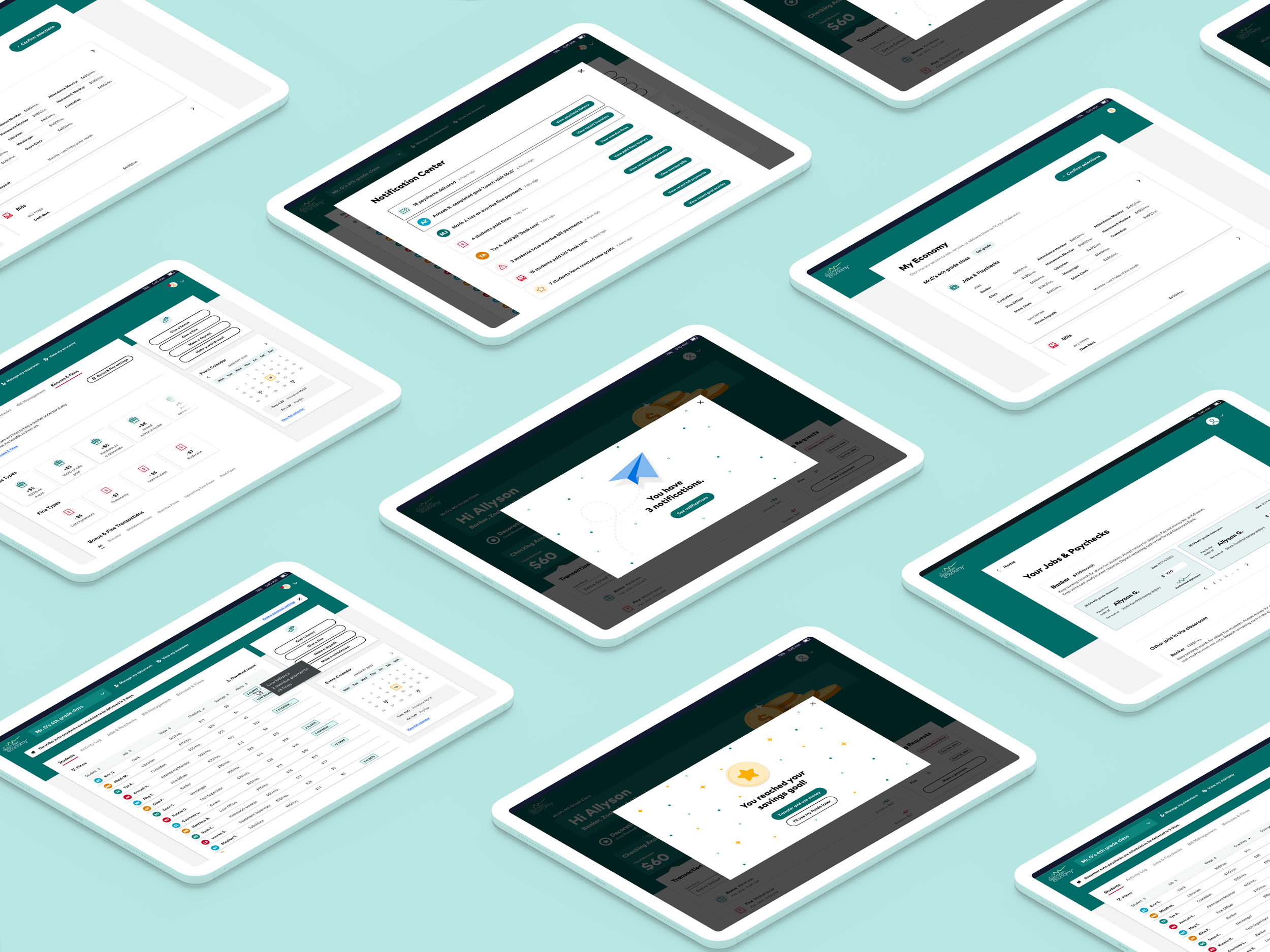
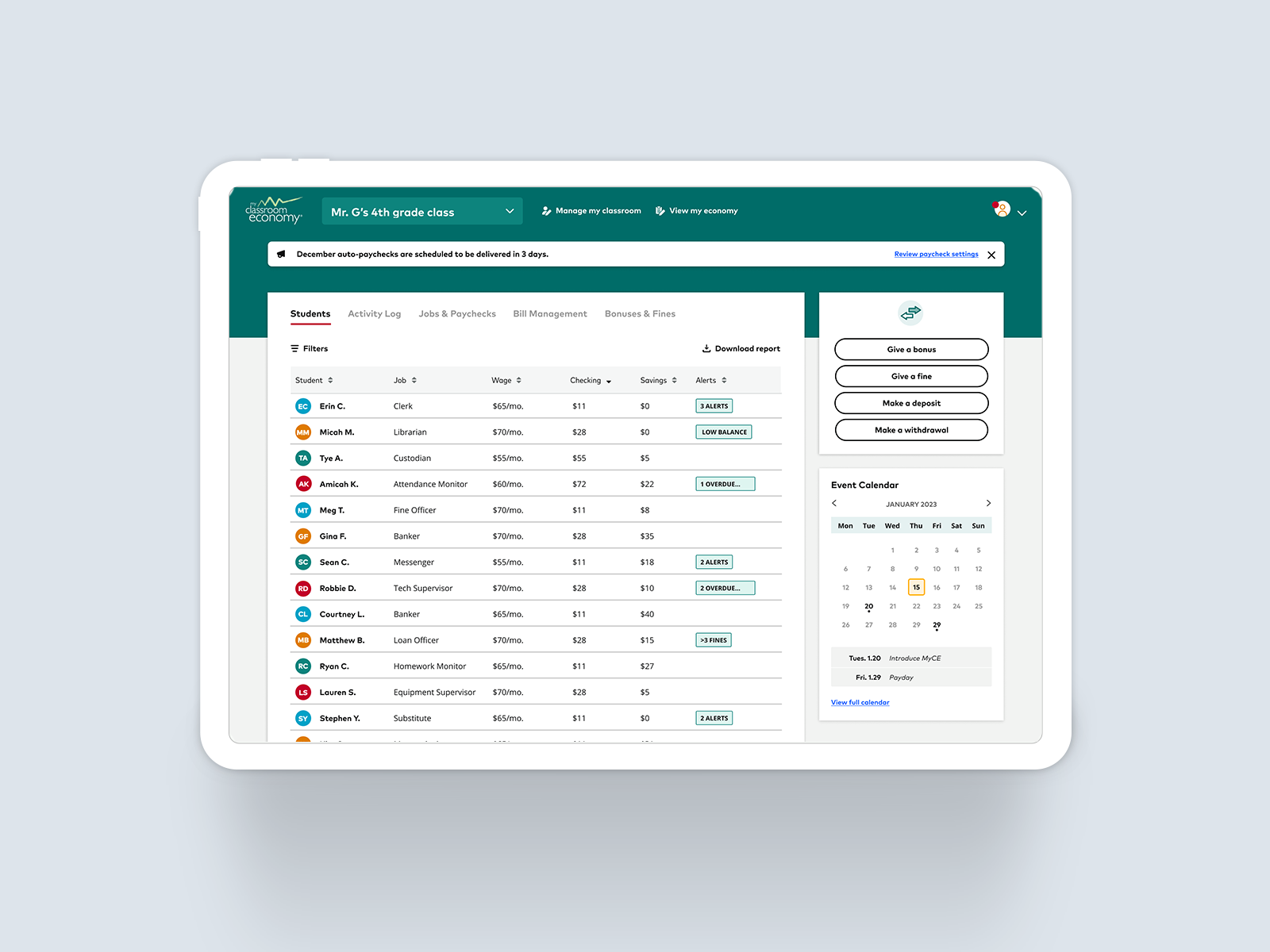
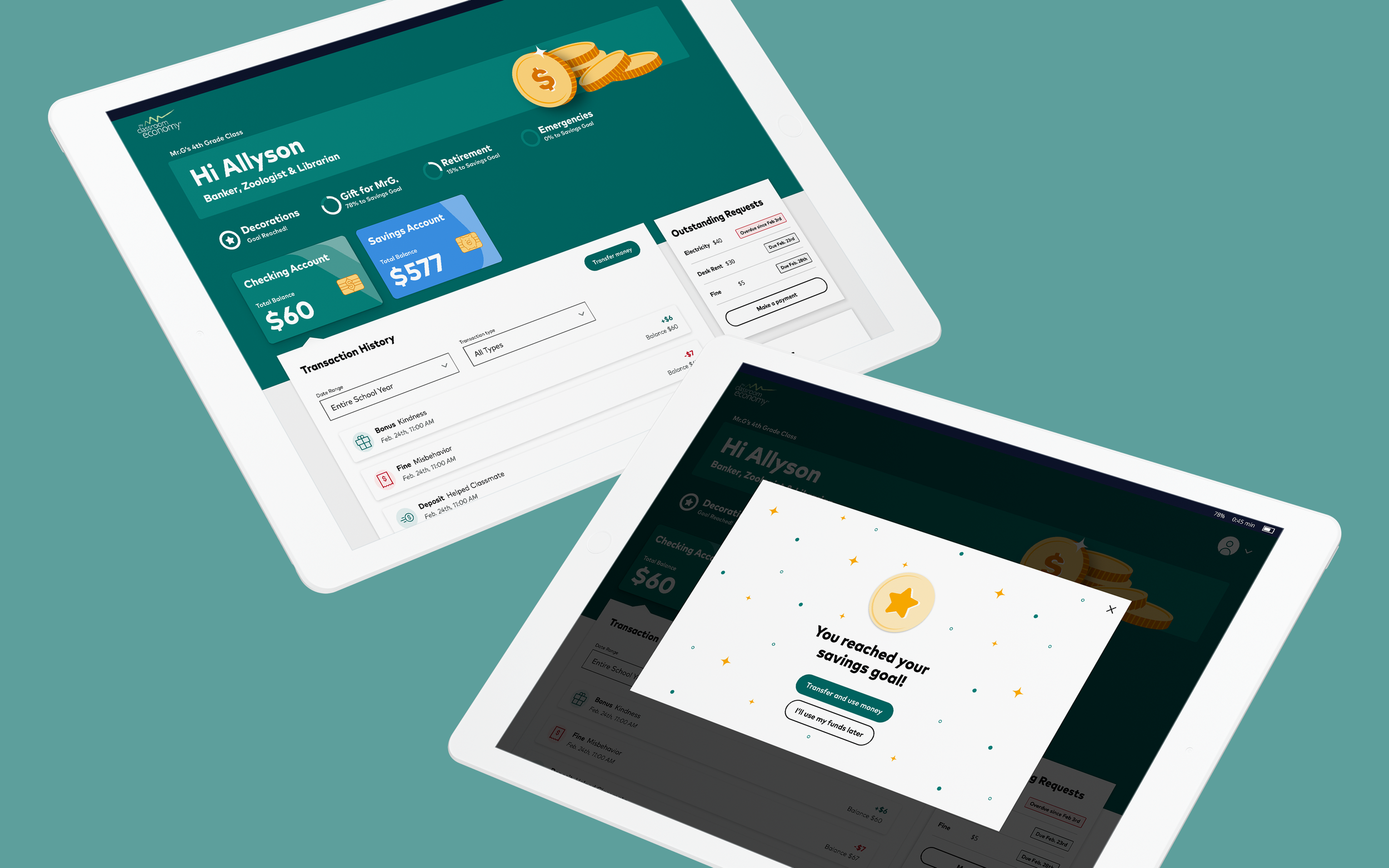
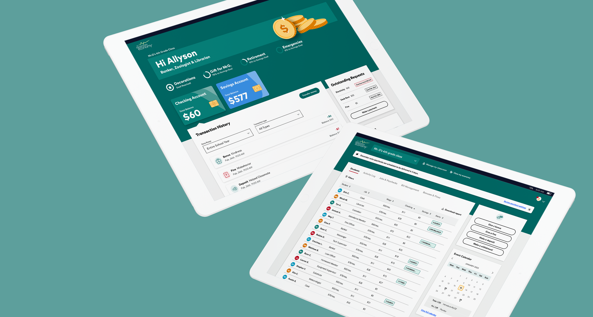
In 2022 I had the opportunity to work on a team of visual designers, user researchers, project managers, and the product owner to develop a project with a leading fortune 500 investment firm, Classroom Economy was created to help teachers and institutions of learning to provide their students a clear understanding for financial literacy.
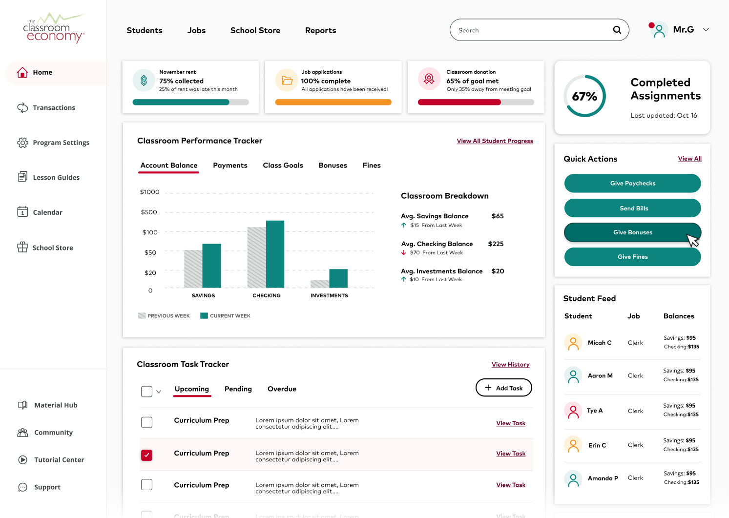
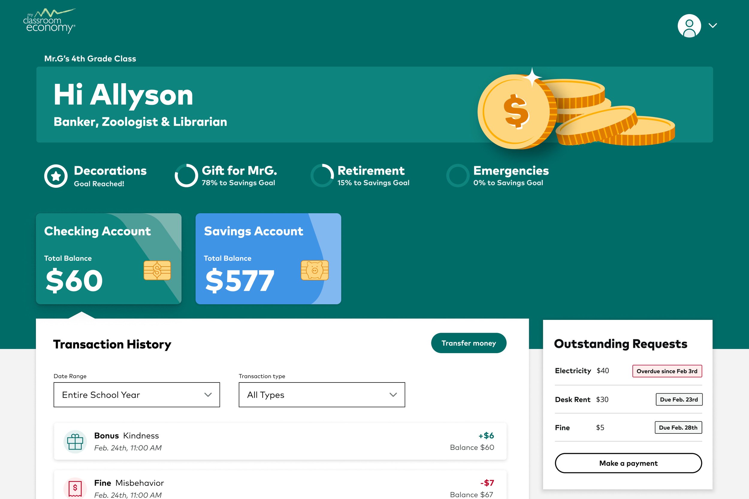
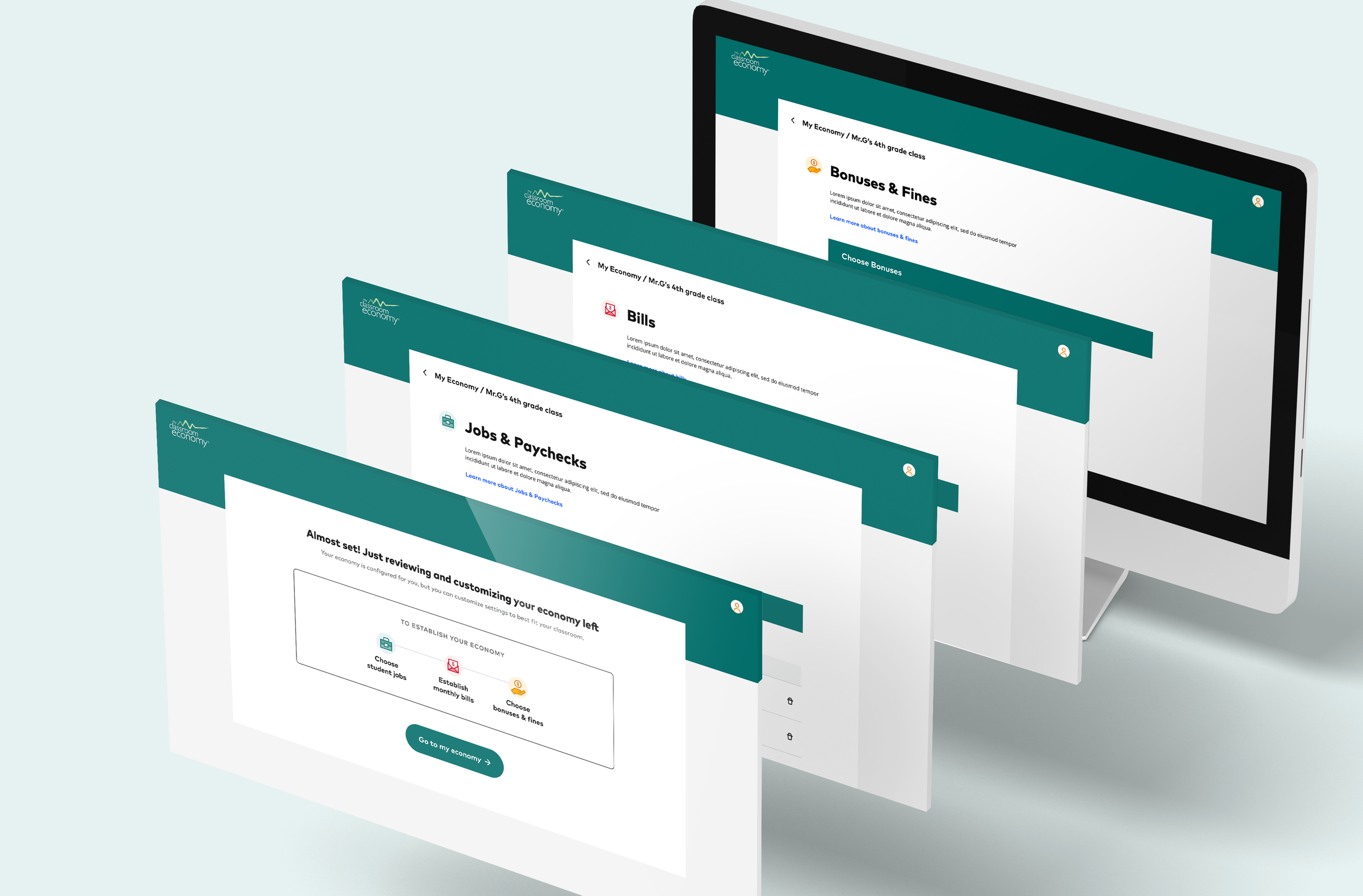
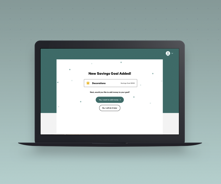
Over the course of 7 months, we crafted a new visual identify, brand system, and hierarchy to help Classroom Economy stand on it’s own as a financial literacy platform.
Development
This process took several months and worked in two phases. My hand in the project followed the second phase. The work included speaking with representatives of the product owner, comparison to their overall goal of the product, and collaborating with the software development team to ensure we could meet those tight deadlines while producing a powerful MVP that both our team and the product owner would be proud of.
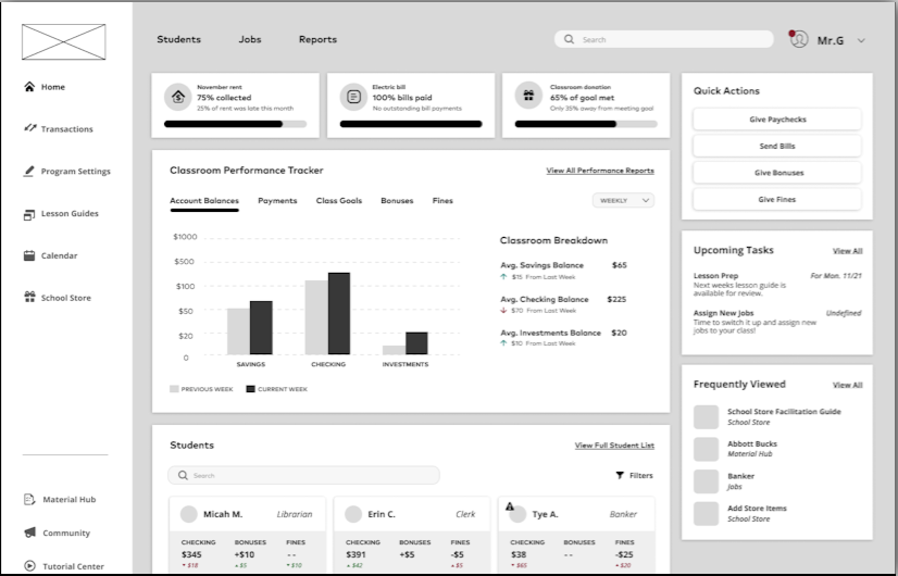
Wireframing and Ideation
Sometimes plans change and nothing is set in stone. Over the course of the design phase, we constantly revisited our sketches and wire-framing of the platform. Many times we made tweaks to the content organization based on the product owner’s critiques. While the main goal of the project stayed the same, several times we revisited the design completely.
